Brand Identity Design________
the culture ministry
The Culture Ministry is the place for all things Diversity & Inclusion. Armed with a mission to develop and support best practices for D&I, Lisa came to us with a clear brief for building a brand that was bold but approachable, playful yet credible, and most importantly inclusive.


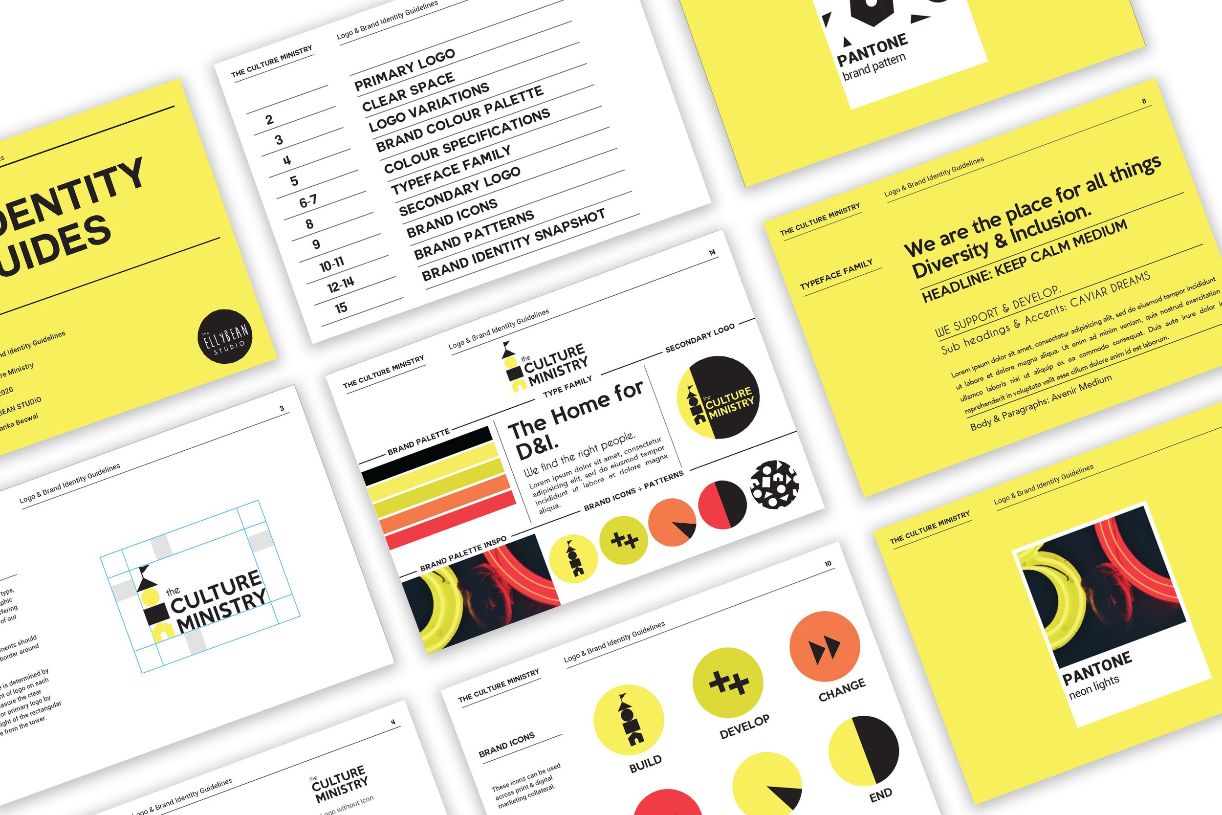
We used varied shapes that built a tower or ‘ministry’ for this brand identity. It was a simple, memorable visual with layers of meaning. Each shape represented diverse individuals, that eventually came together to build a beautiful, strong tower. The identity was purposefully simplified, to gurther represent the practise of making D&I easy.
We used a colour pallete called “Neon Lights’, that not only personfiied the founder Lisa’s personality, but also gave the brand a bold, inviting & energizing vibe.
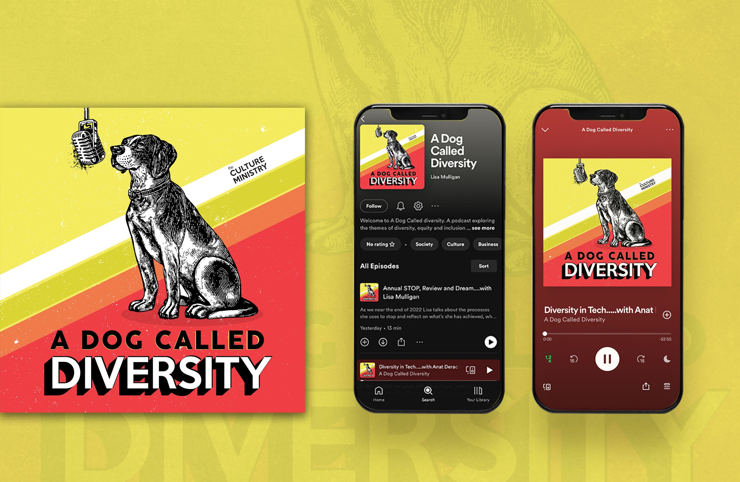
We worked on the brand identity with a detailed framework, complete with an identity manual including brand patterns and icons for online marketing communications. In addition to this, we designed a podcast cover for The Culture Ministry.
